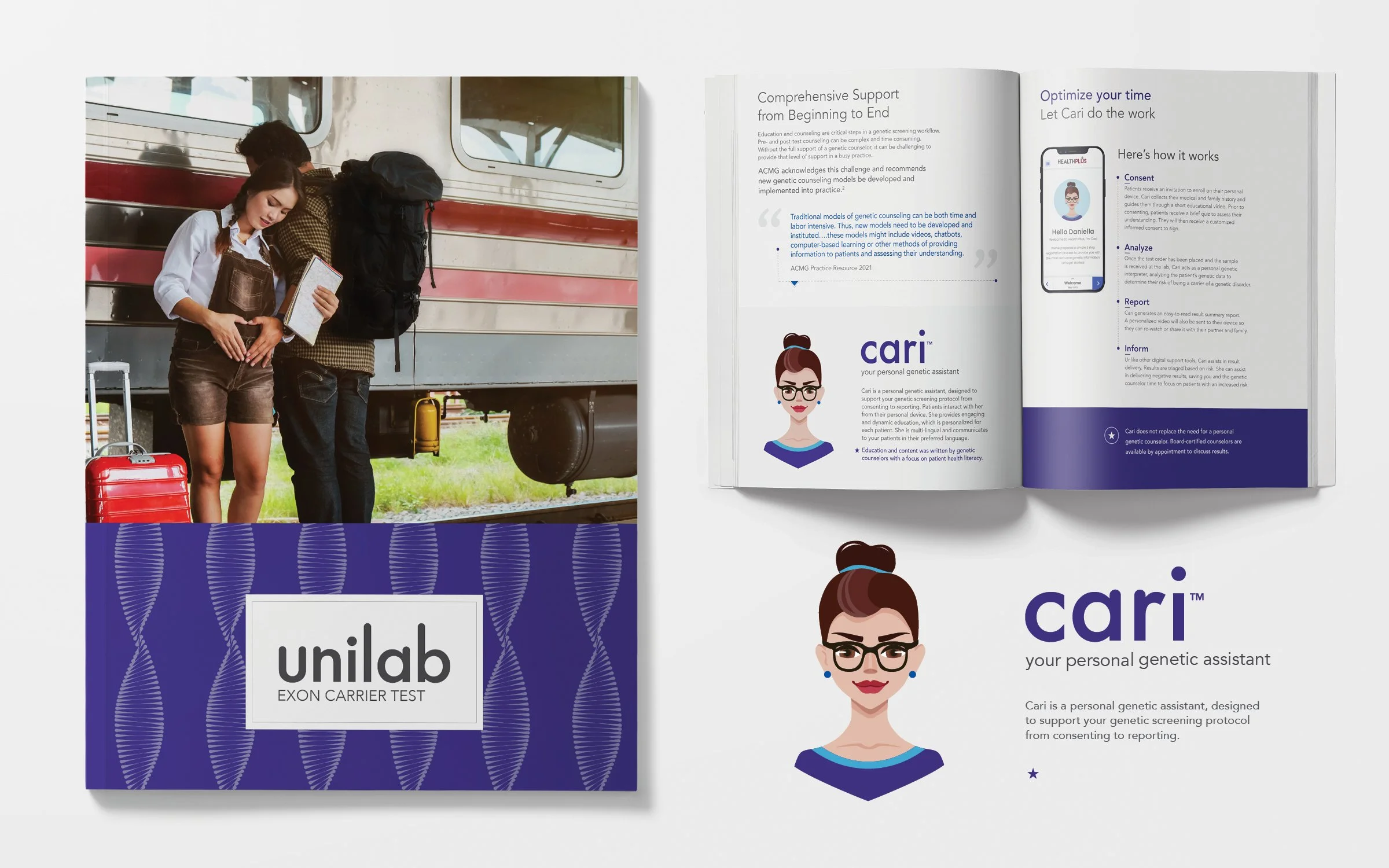
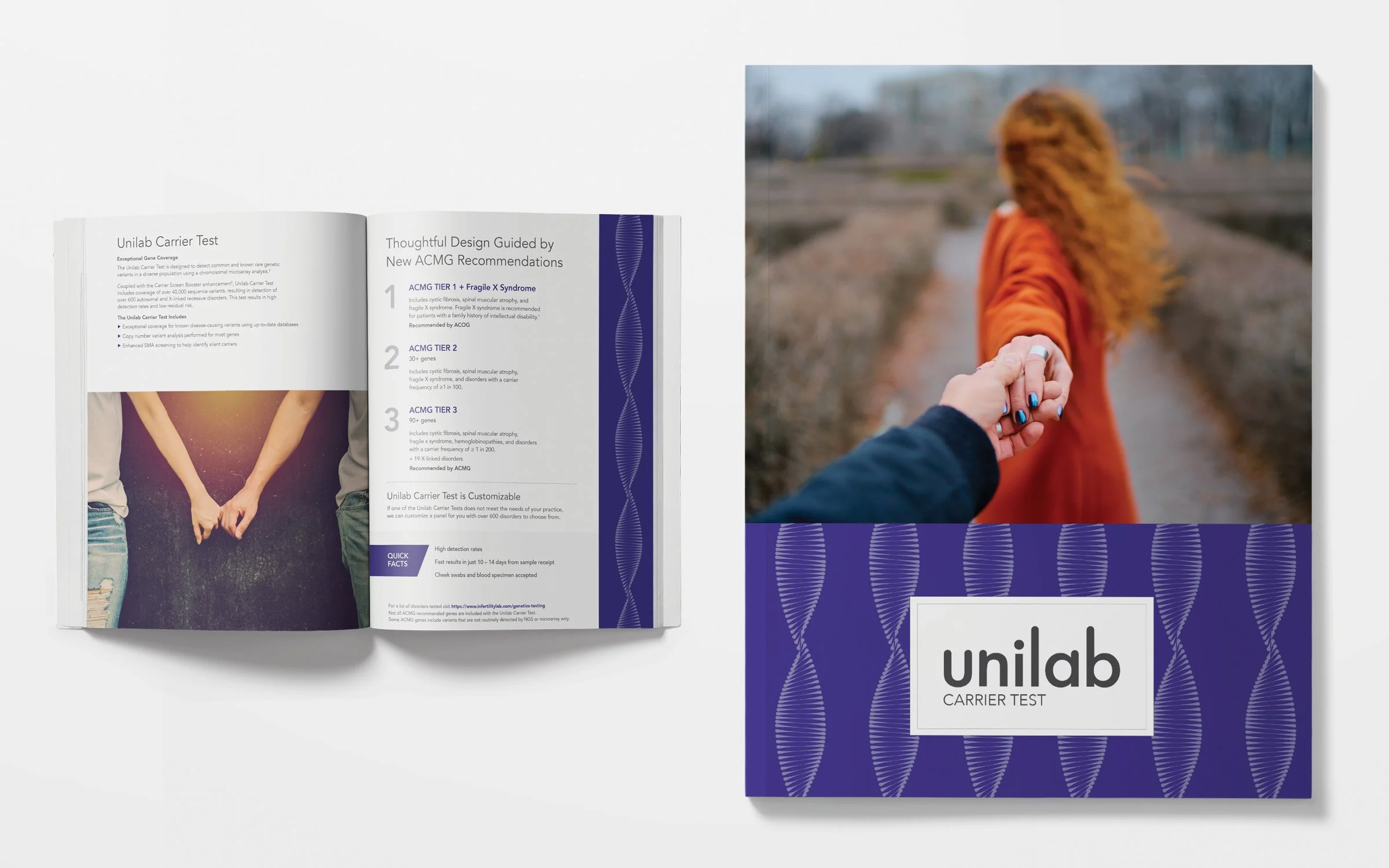
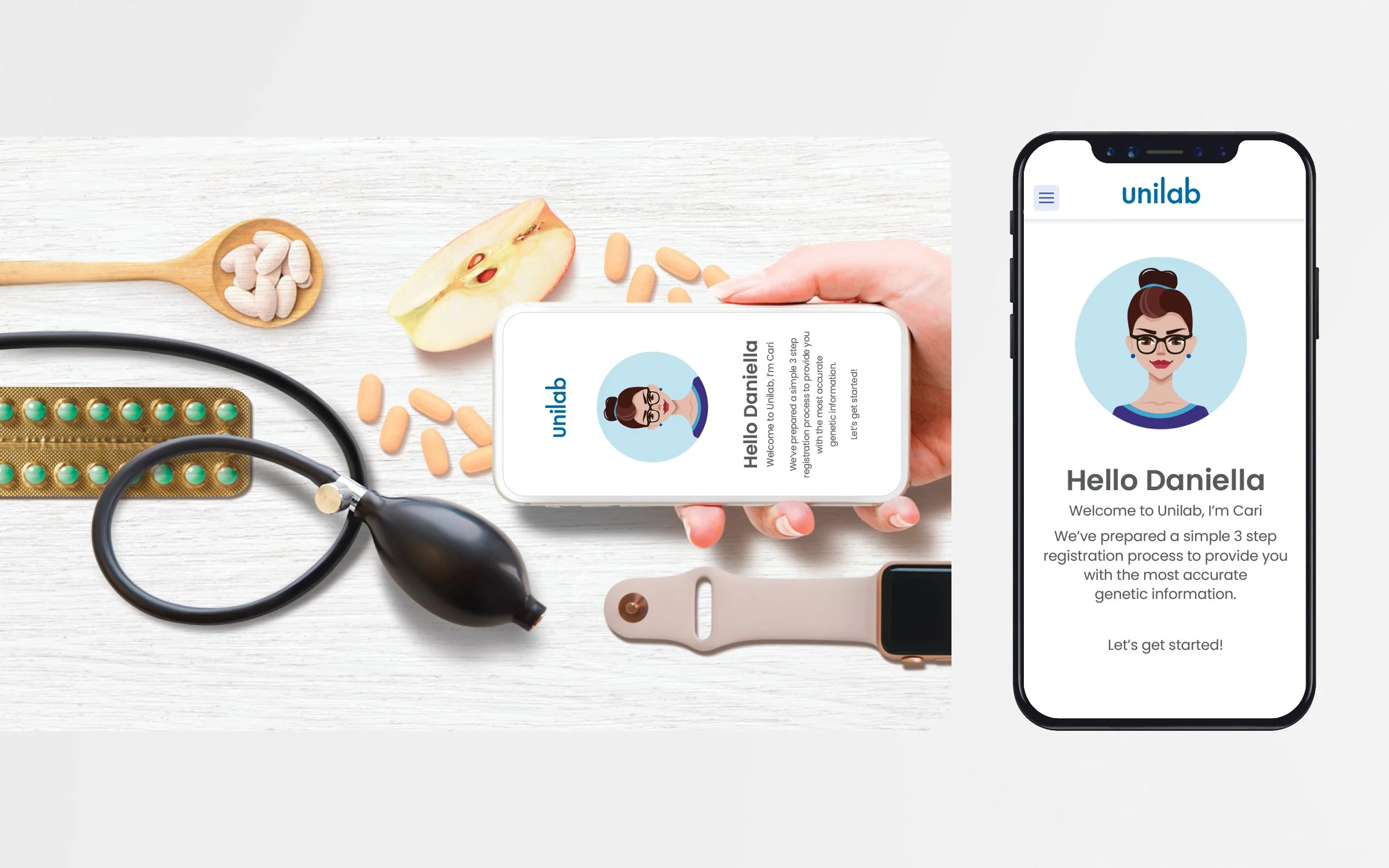
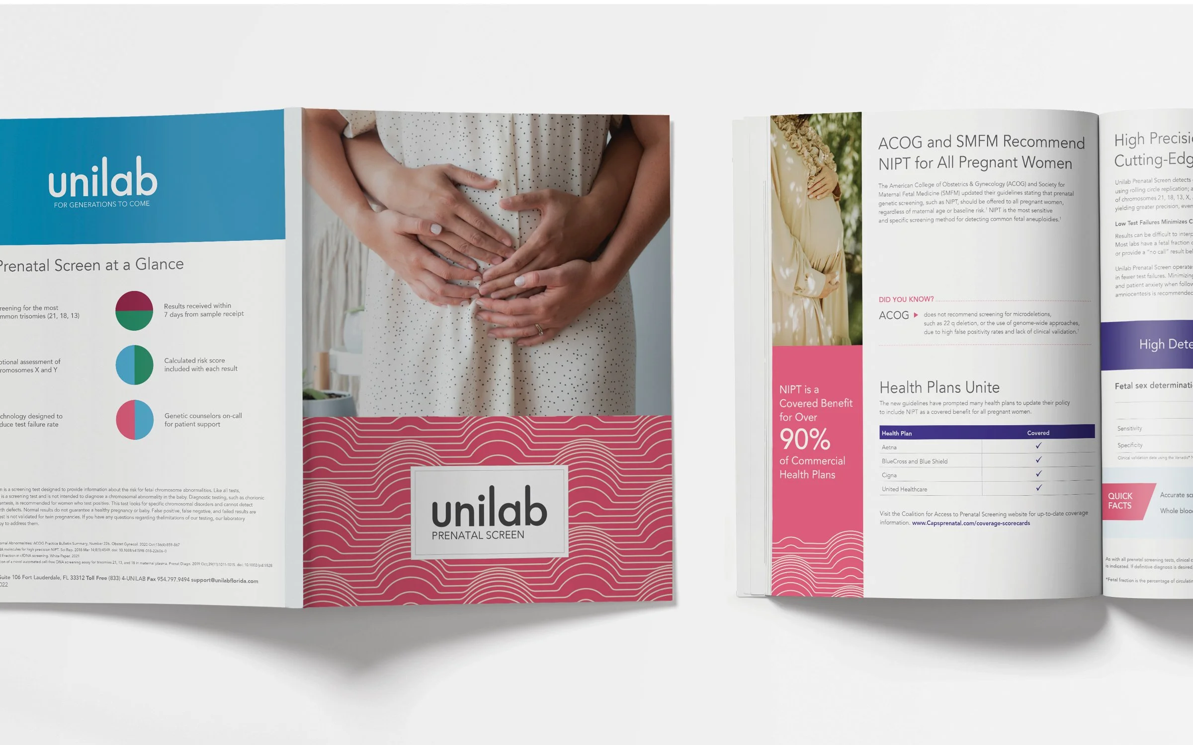
Unilab is a family-owned laboratory with over 35 years of expertise, specializing in reproductive health and hormone testing. For this complete rebrand, I was given creative freedom to explore playful and interpretive approaches to imagery and graphics. The goal was to modernize the brand and make it feel approachable, reflecting its expansion into at-home lab testing while maintaining the trust and reliability built over decades.
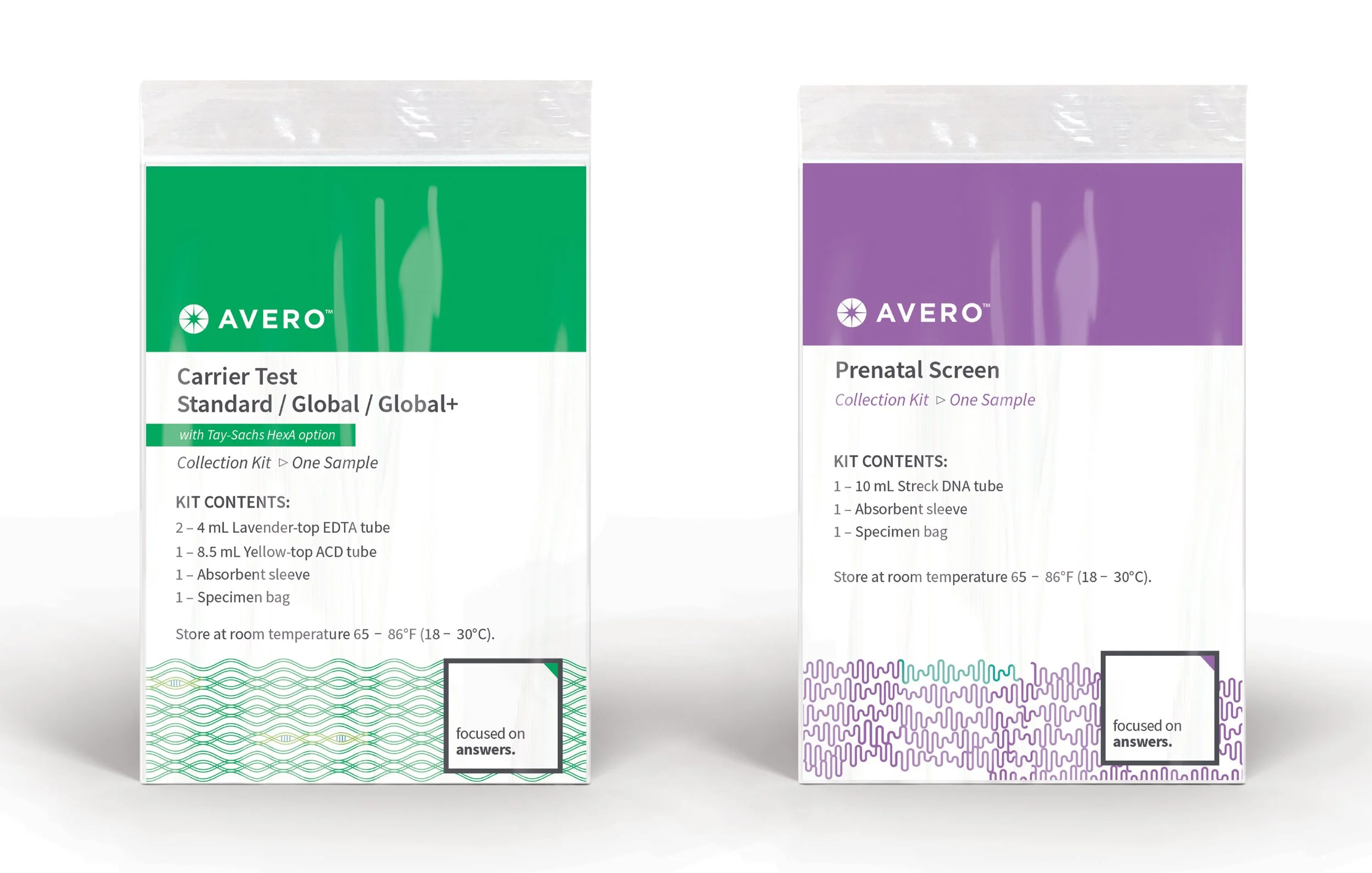
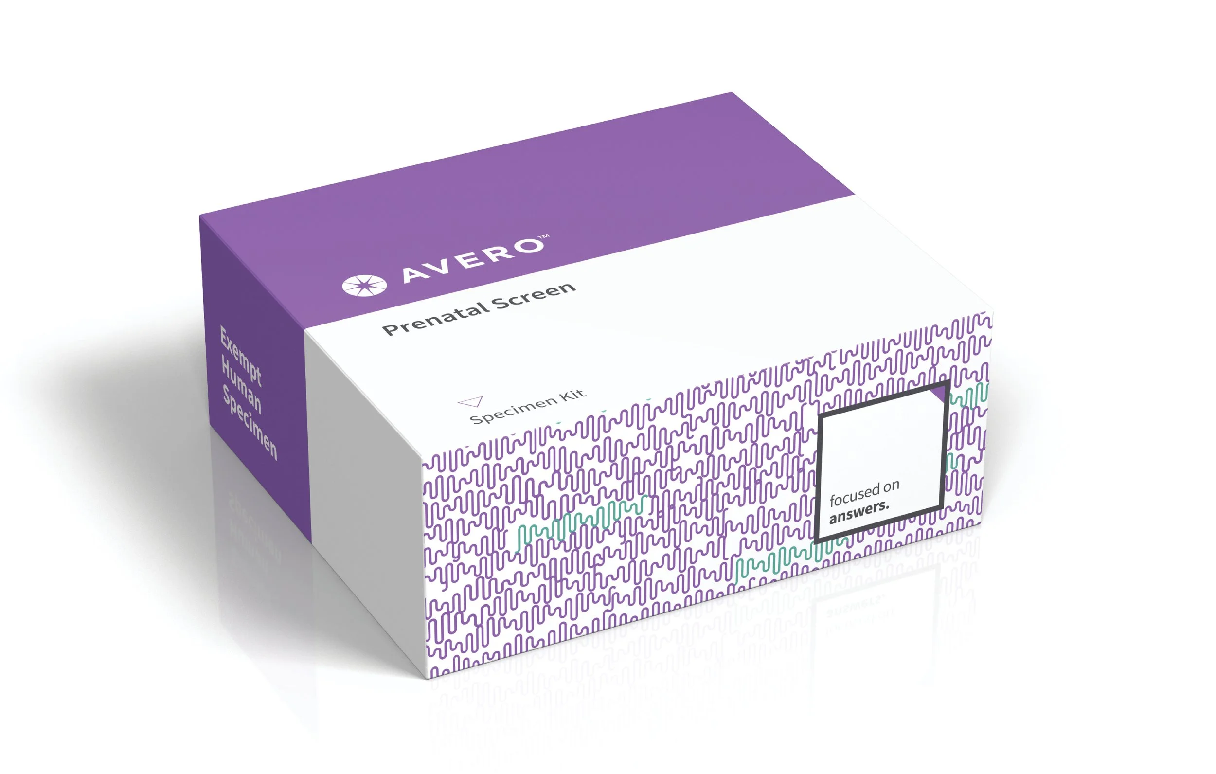
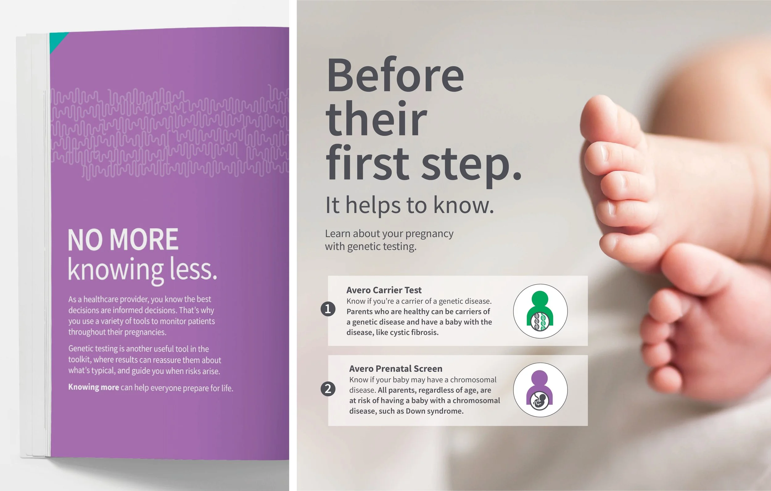
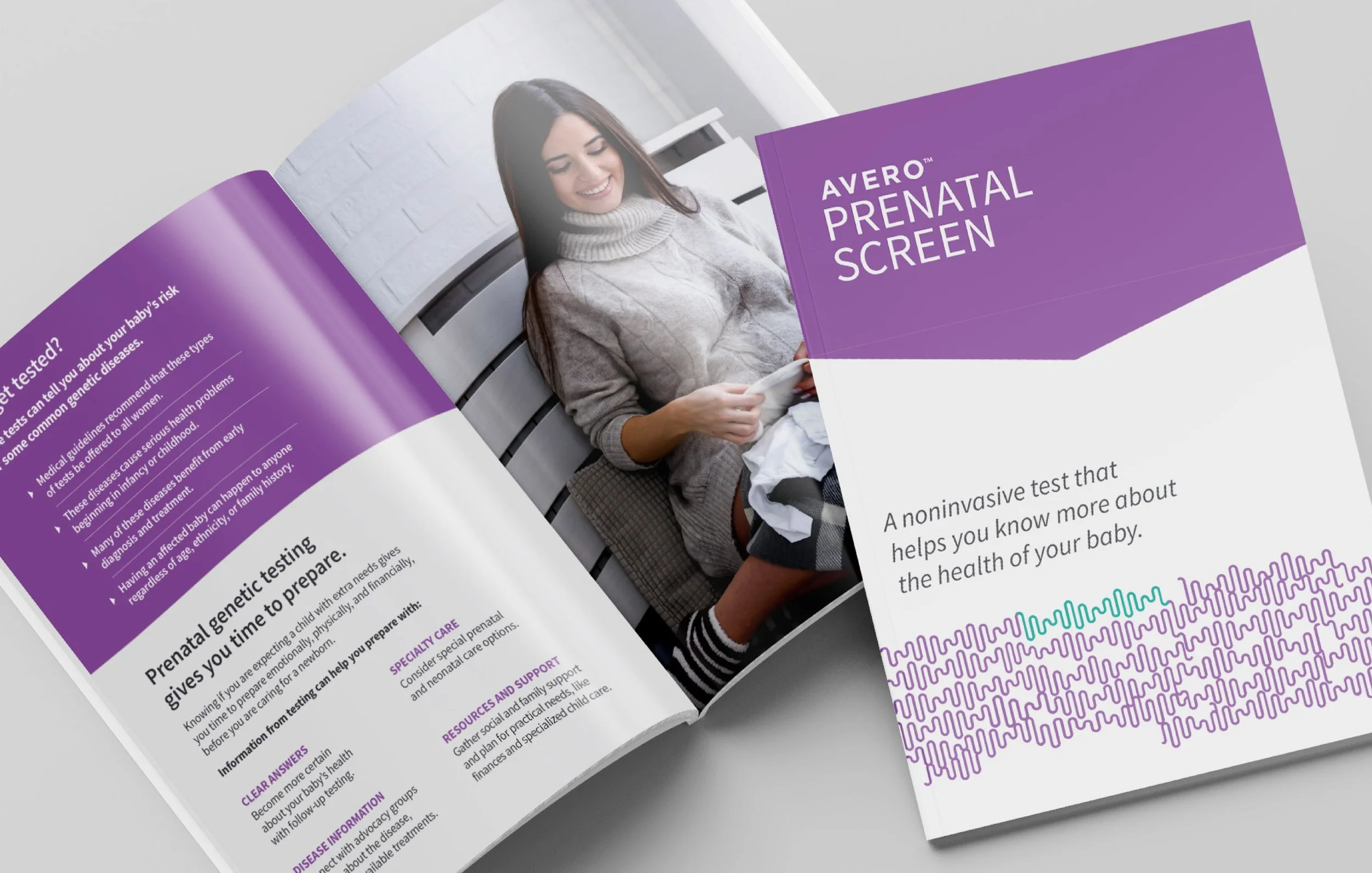
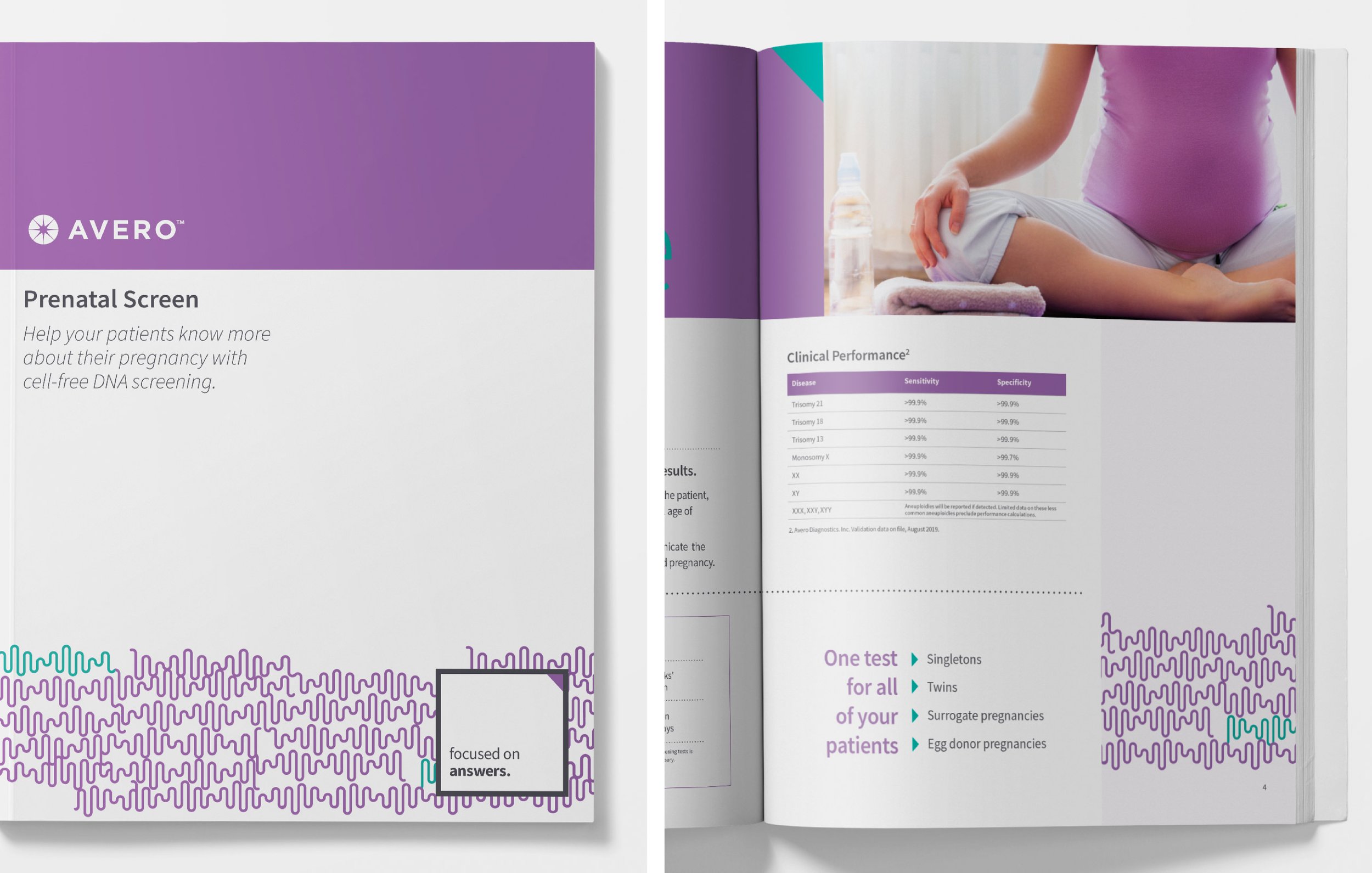
Avero is a pathology laboratory specializing in breast, gastrointestinal, gynecologic, dermatologic, hematologic, molecular, surgical, and urologic pathology. Its brand is rooted in the concept of being “focused on health,” reflecting precision, clarity, and an unwavering commitment to patient wellbeing.
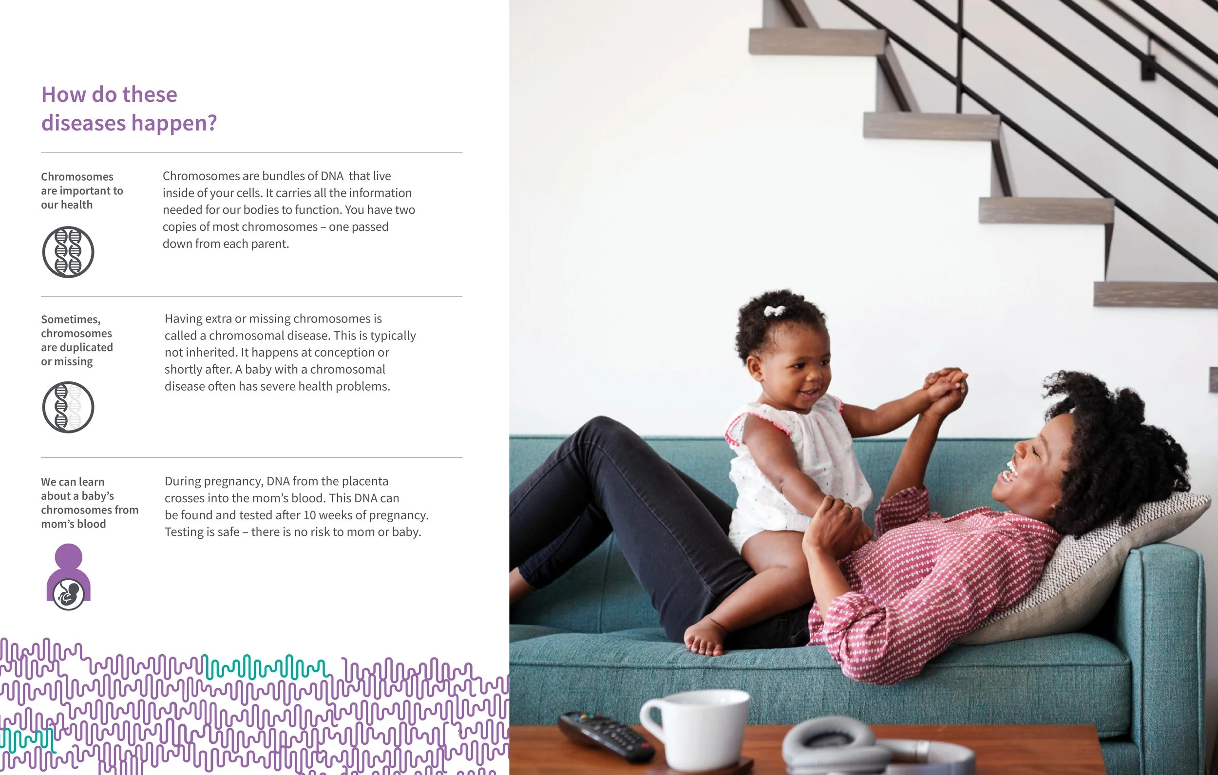
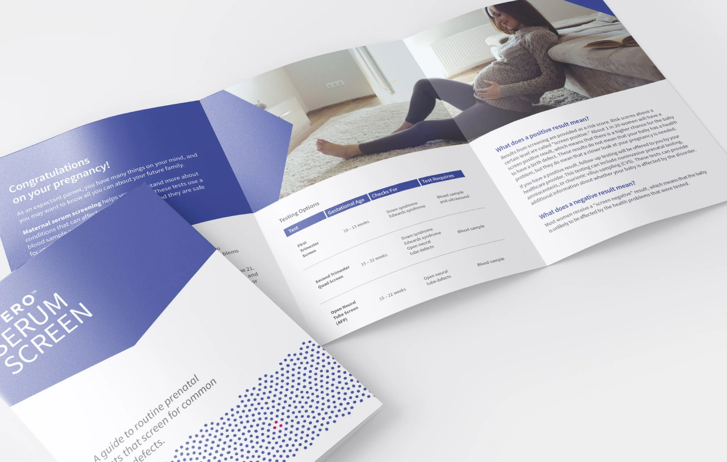
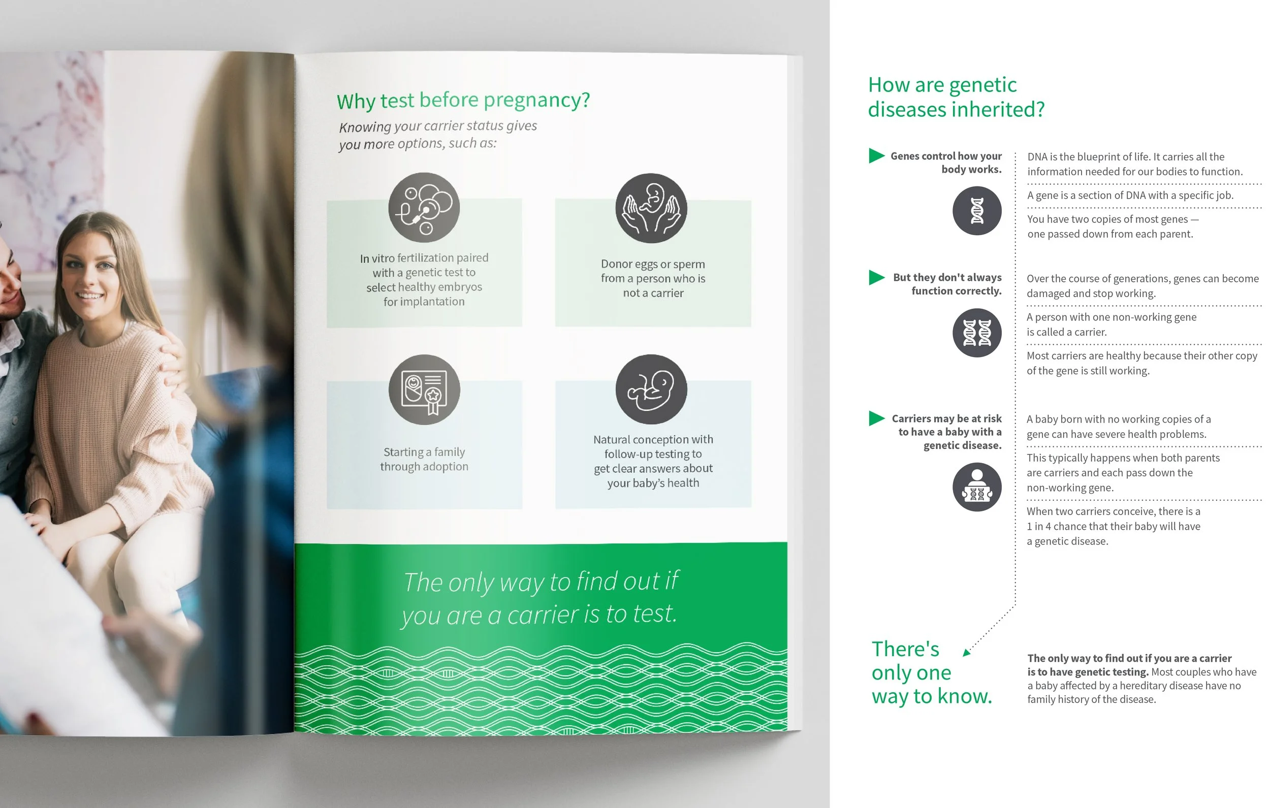
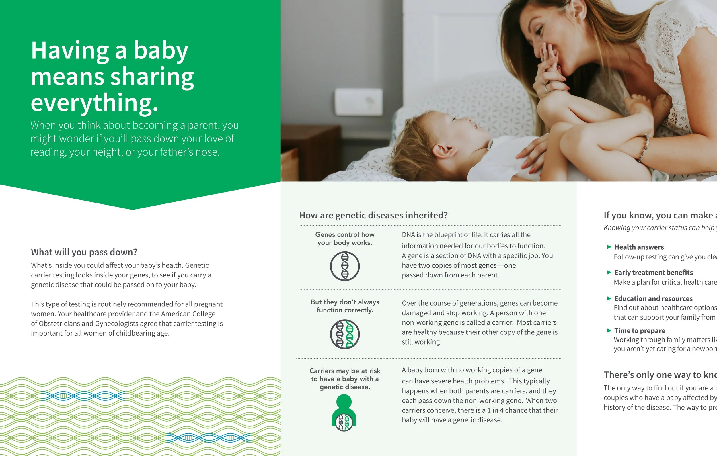
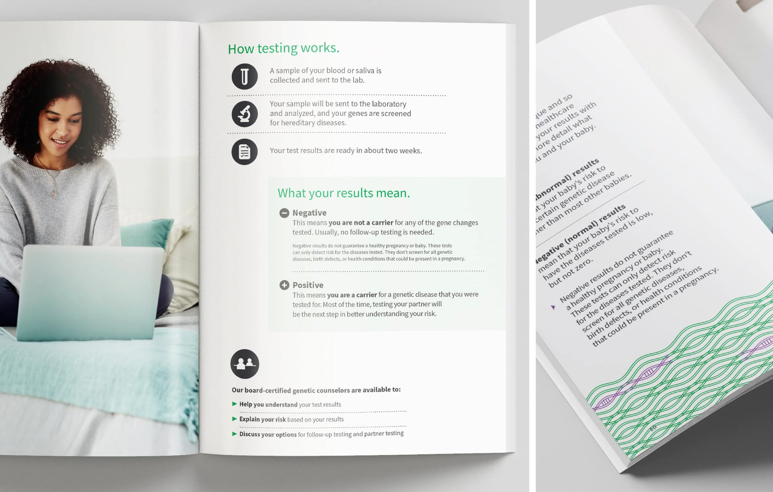
This series centers on prenatal genetic testing and conception, moments defined by anticipation, care, and possibility. The work translates Avero’s focused approach into a visual language that feels both intimate and reassuring. Imagery and composition emphasize clarity, protection, and the quiet complexity of early life, balancing scientific rigor with emotional sensitivity.
Through restrained, intentional design, the campaign positions Avero as a trusted partner at the very beginning of the health journey, where insight, accuracy, and compassion converge to support patients and providers during one of life’s most meaningful stages.

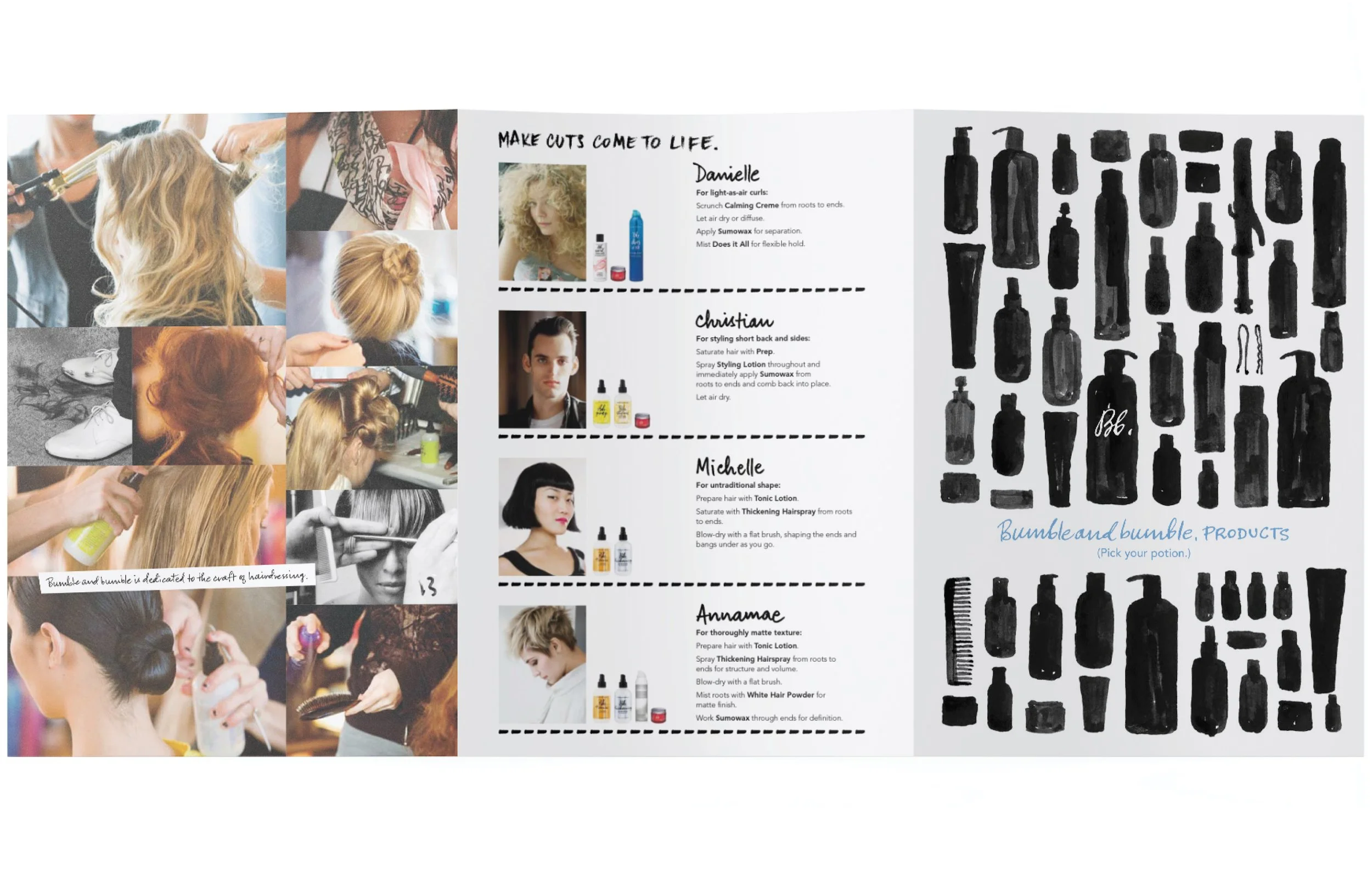
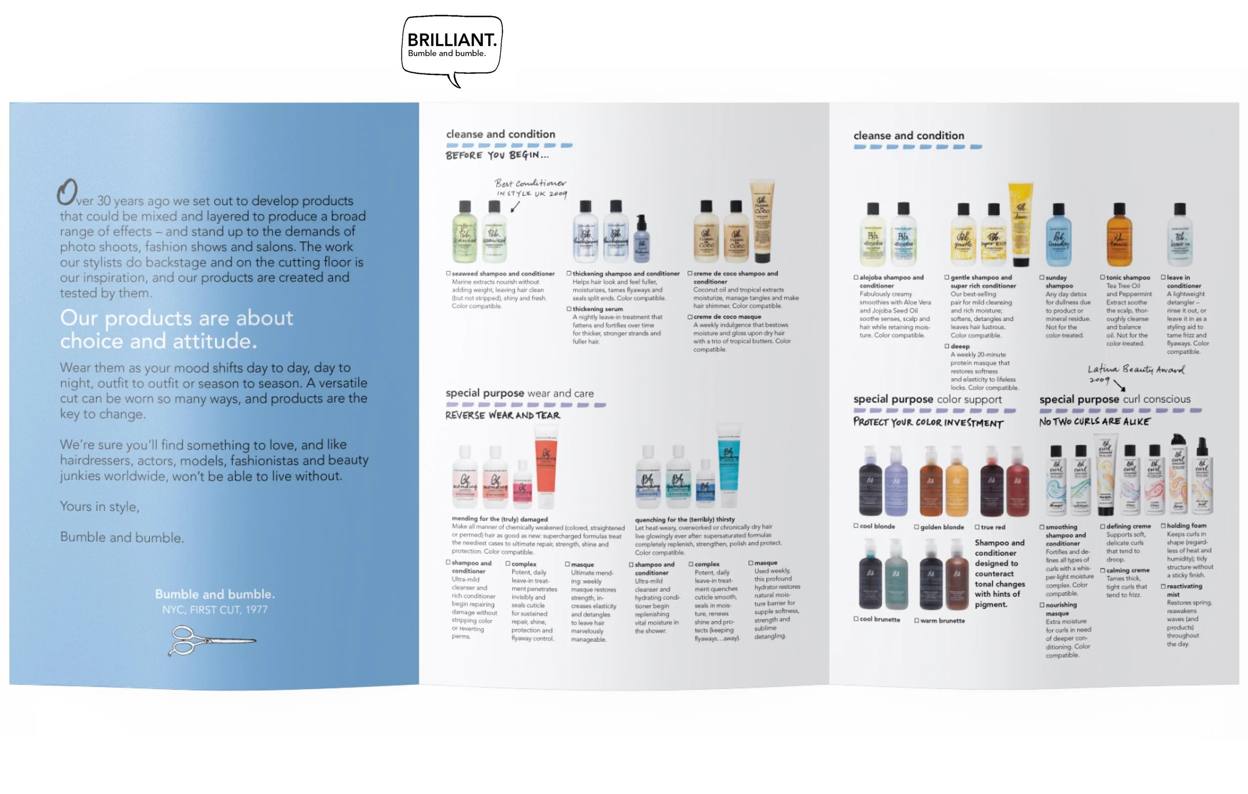
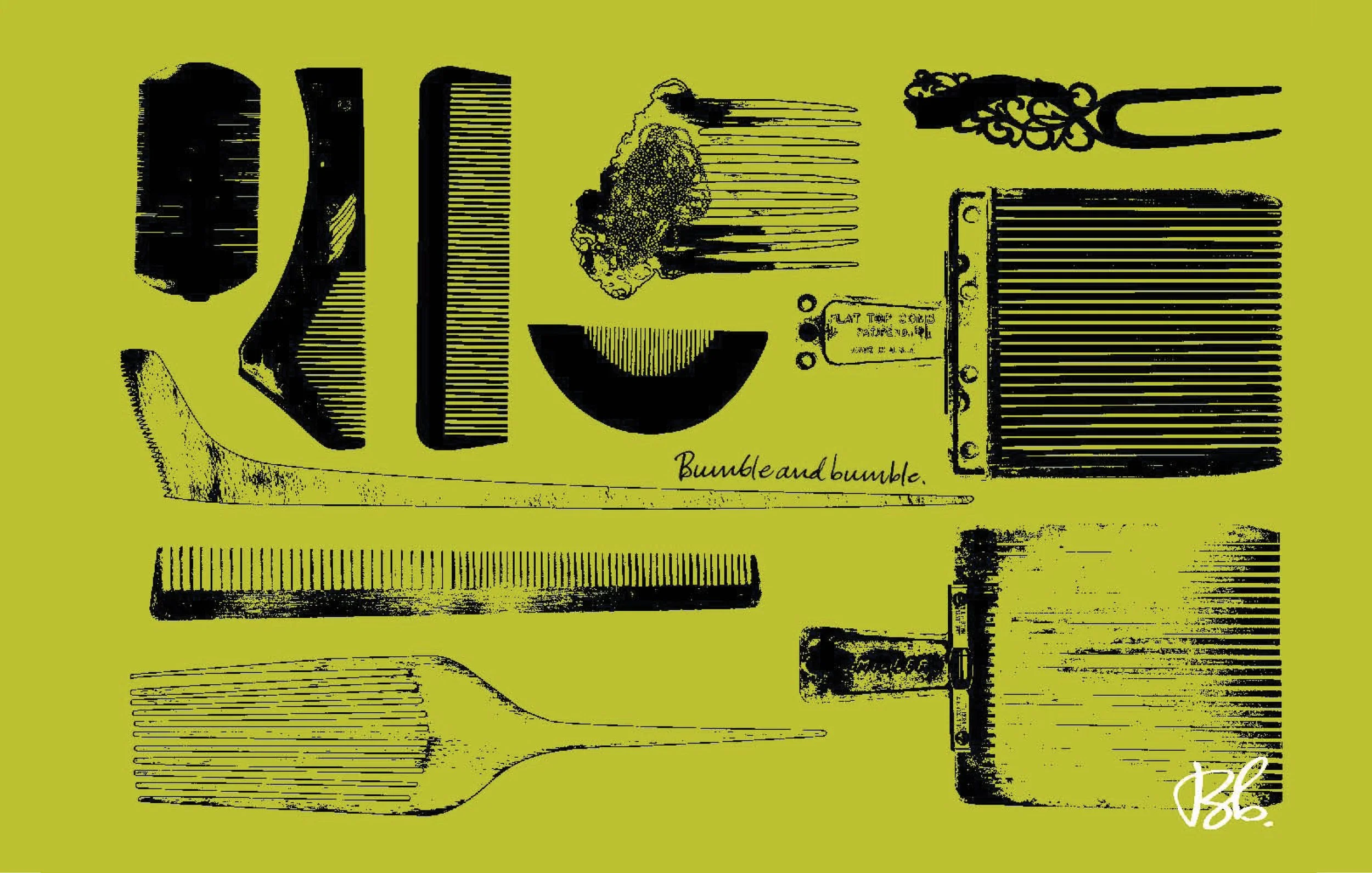
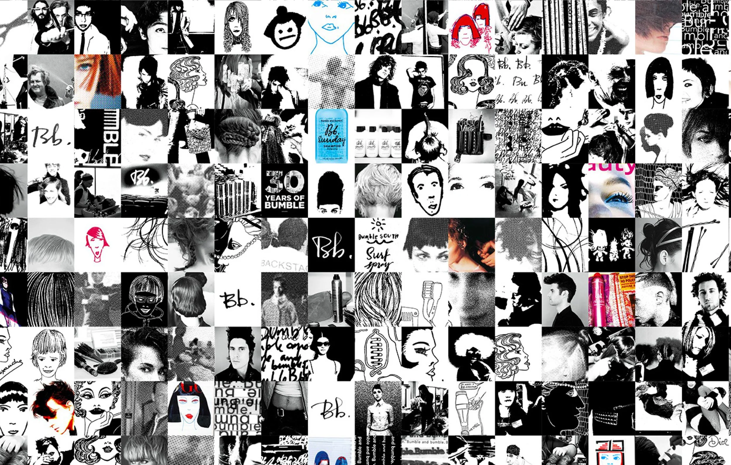
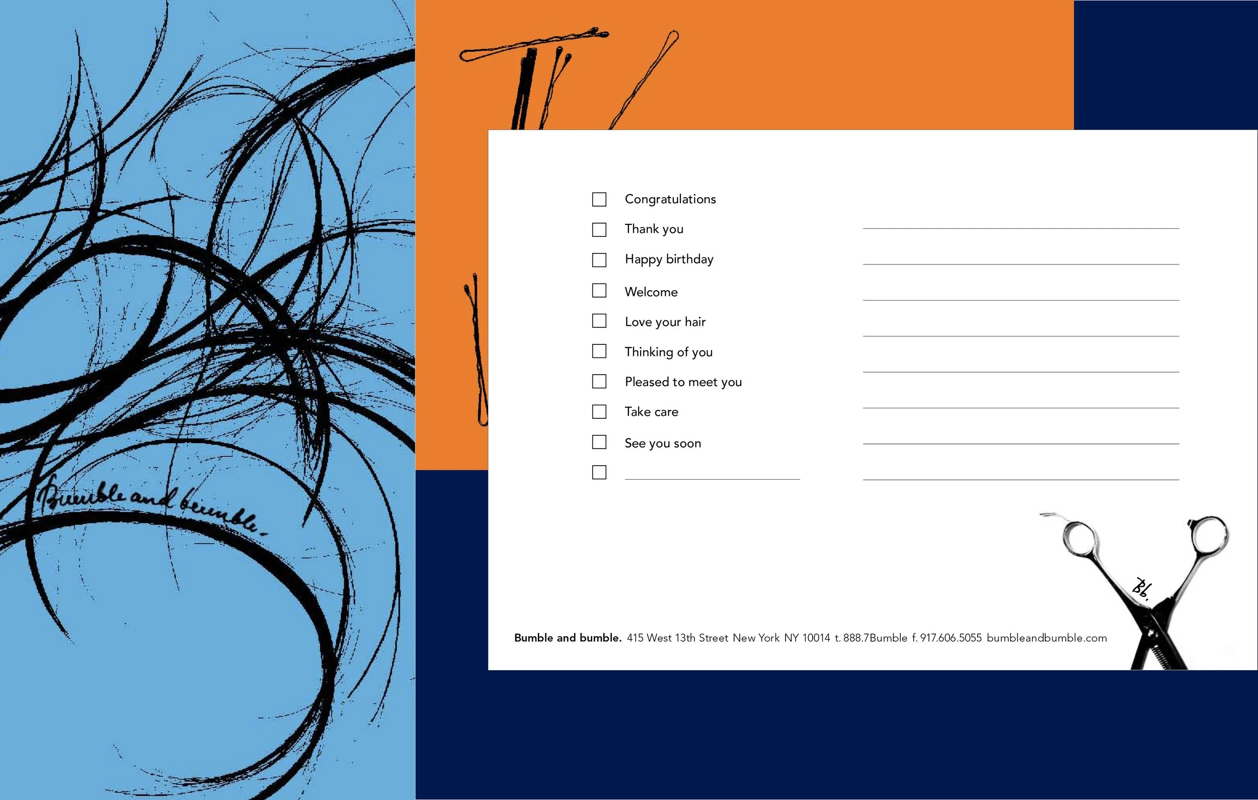
Bumble and bumble thrives in the details, the hand-drawn marks, the rogue flourishes, the unexpected touches that make every piece feel alive. Even the simplest guide or product element becomes a tiny work of art, full of personality and intention. These are the projects I’ve shaped with that same edge. Design that isn’t just functional, but collectible, playful, and unmistakably Bumble.

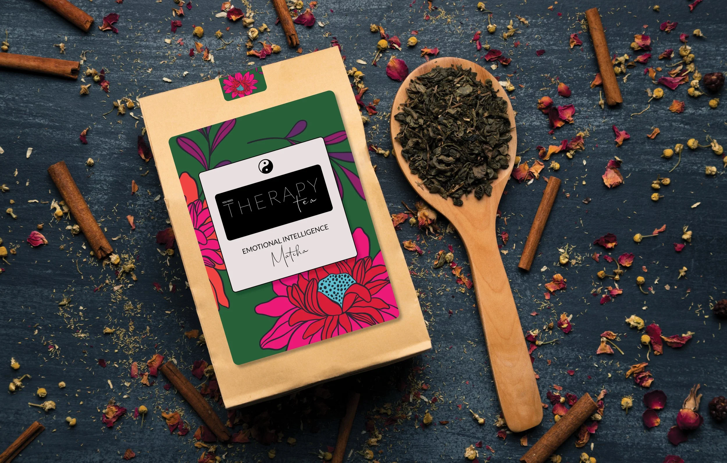
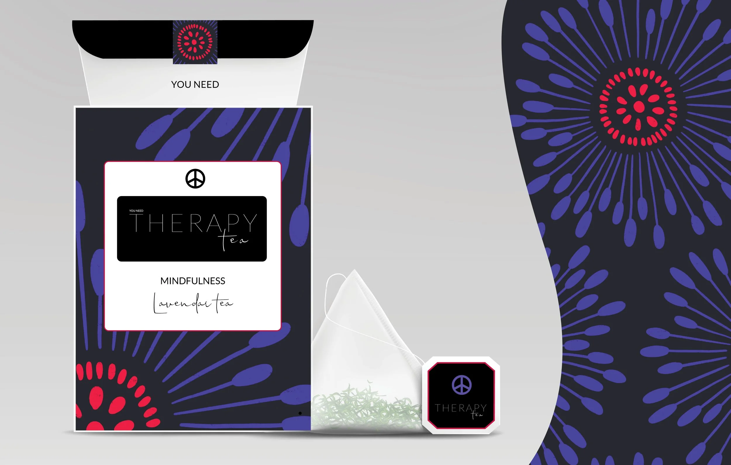
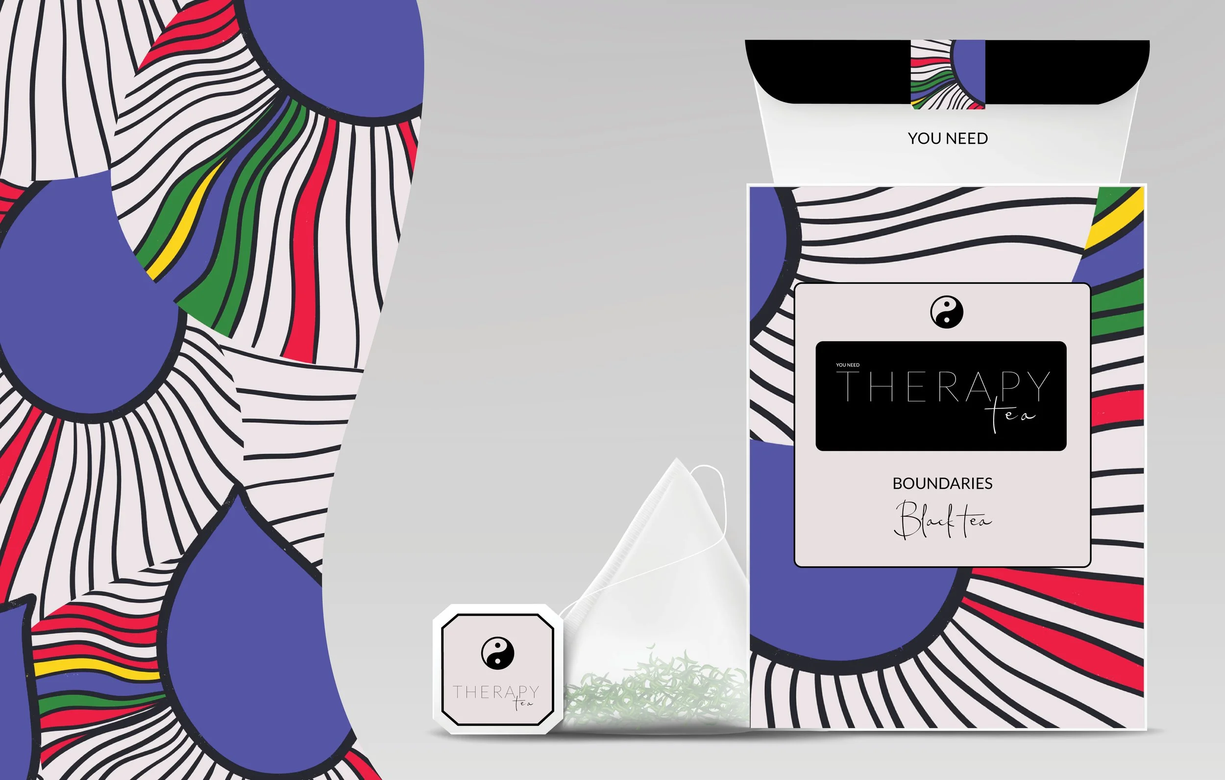
Tea has long been a source of healing. Yet true support is rarely something we’re eager to ask for. Therapy tea plays on the quiet truth of comfort in a cup, a subtle wink wrapped in warmth. This collection is dedicated to that one-on-one care we all crave, offering a moment to pause, reflect, and reset. Bold, expressive imagery brings confidence to the ritual, empowering you to help yourself, one cup at a time. The visual language that encourages self-trust, self-care, and the luxury of tending to yourself without explanation. Because sometimes healing doesn’t need to be spoken. It just needs to be poured.
Steeped in healing. A ritual of pause.

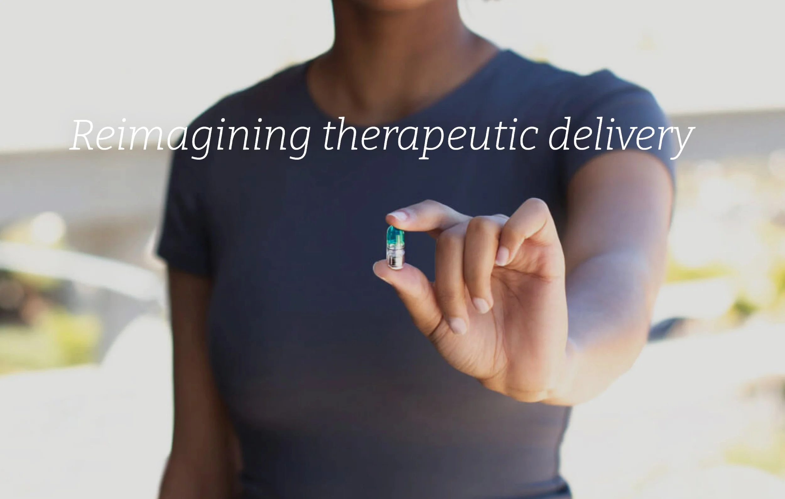
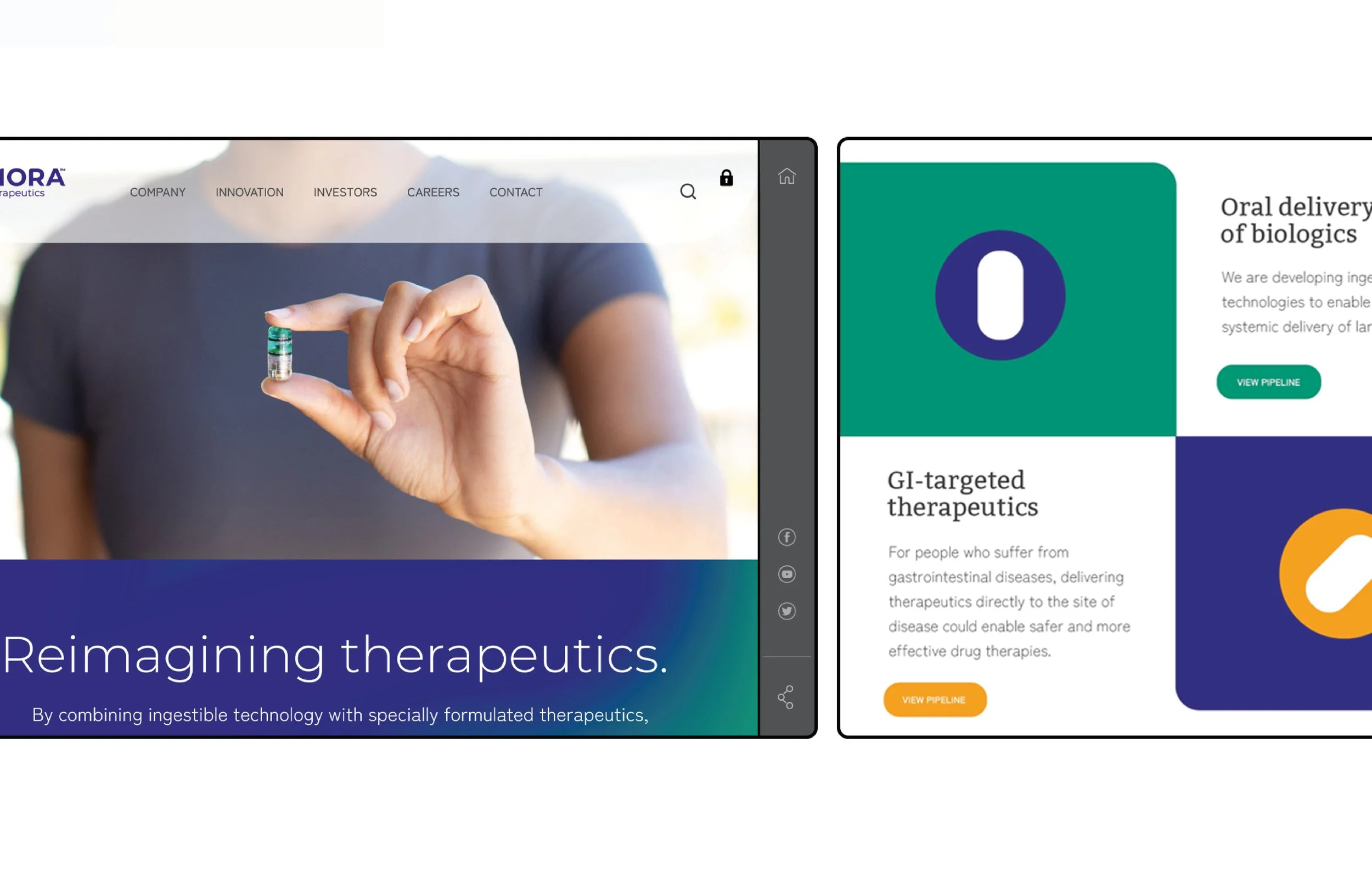
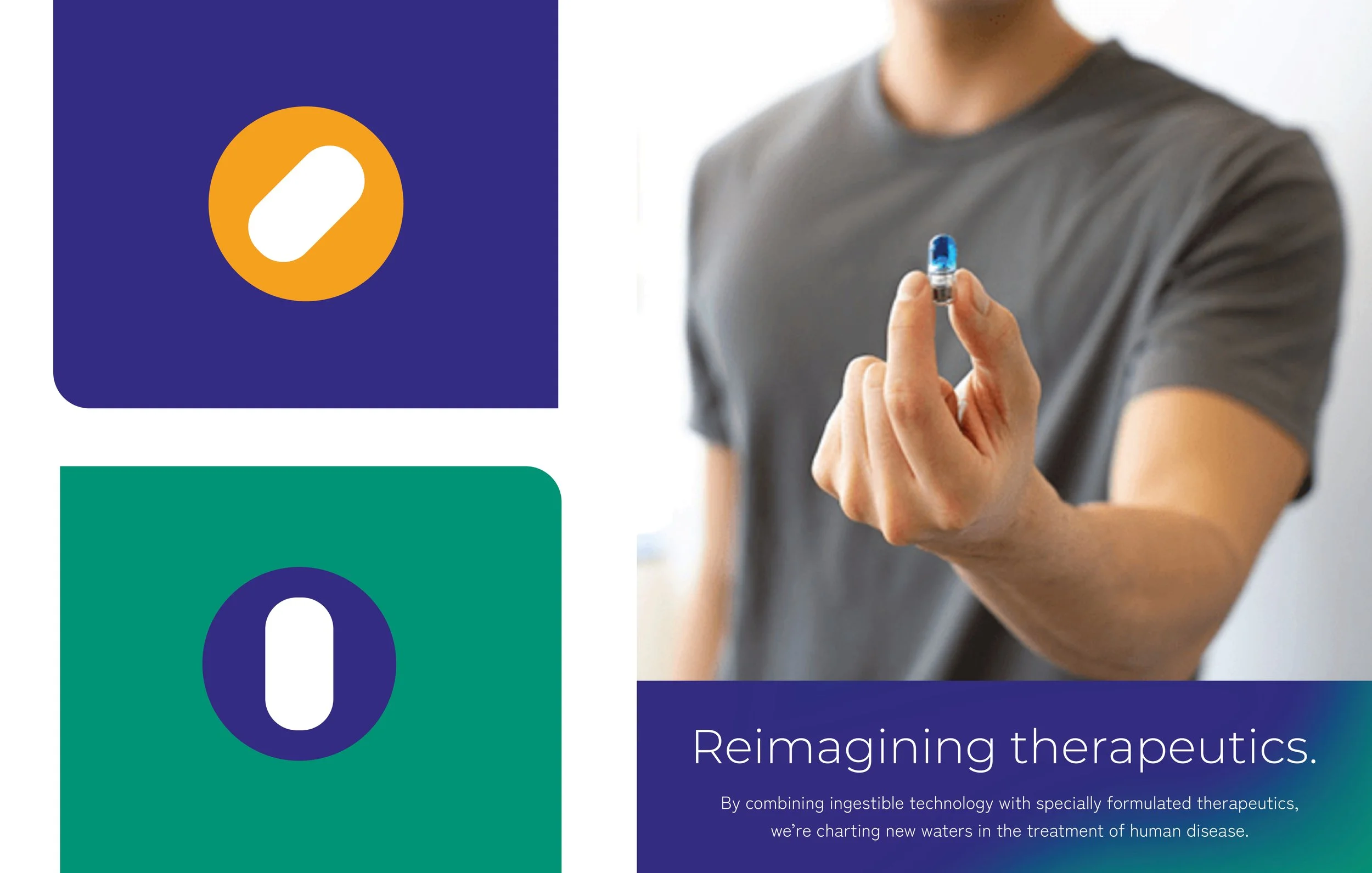
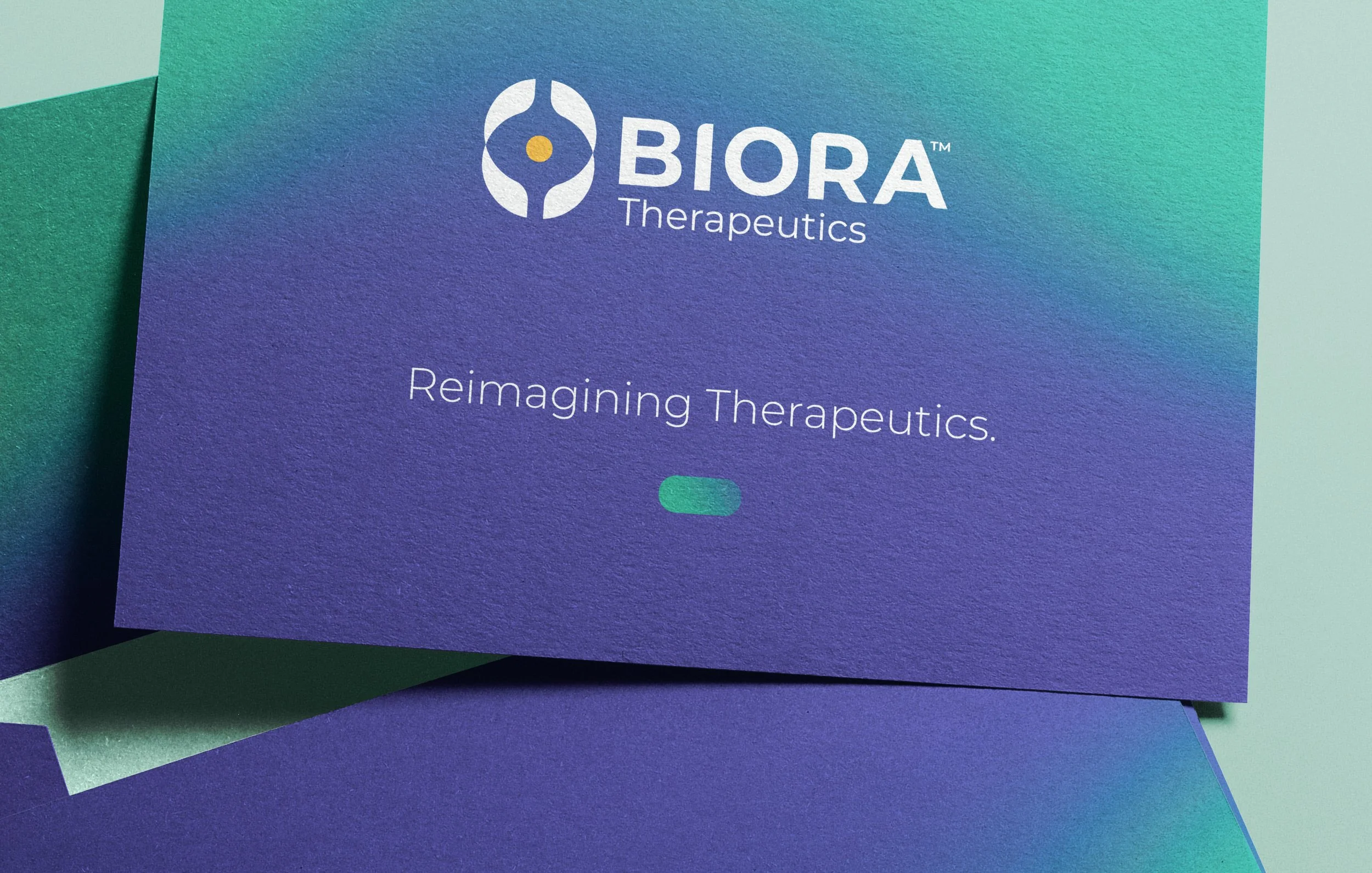
Biora Therapeutics reimagines drug delivery through precision-engineered smart pills that target the GI tract. Designed for systemic, needle-free delivery of biotherapeutics, the technology replaces injections with an oral therapy that improves life for patients managing chronic disease. The visual identity embraces fluidity, echoing the movement, adaptability, and intelligence of the digestive system itself.
Visit the site: https://www.bioratherapeutics.com/